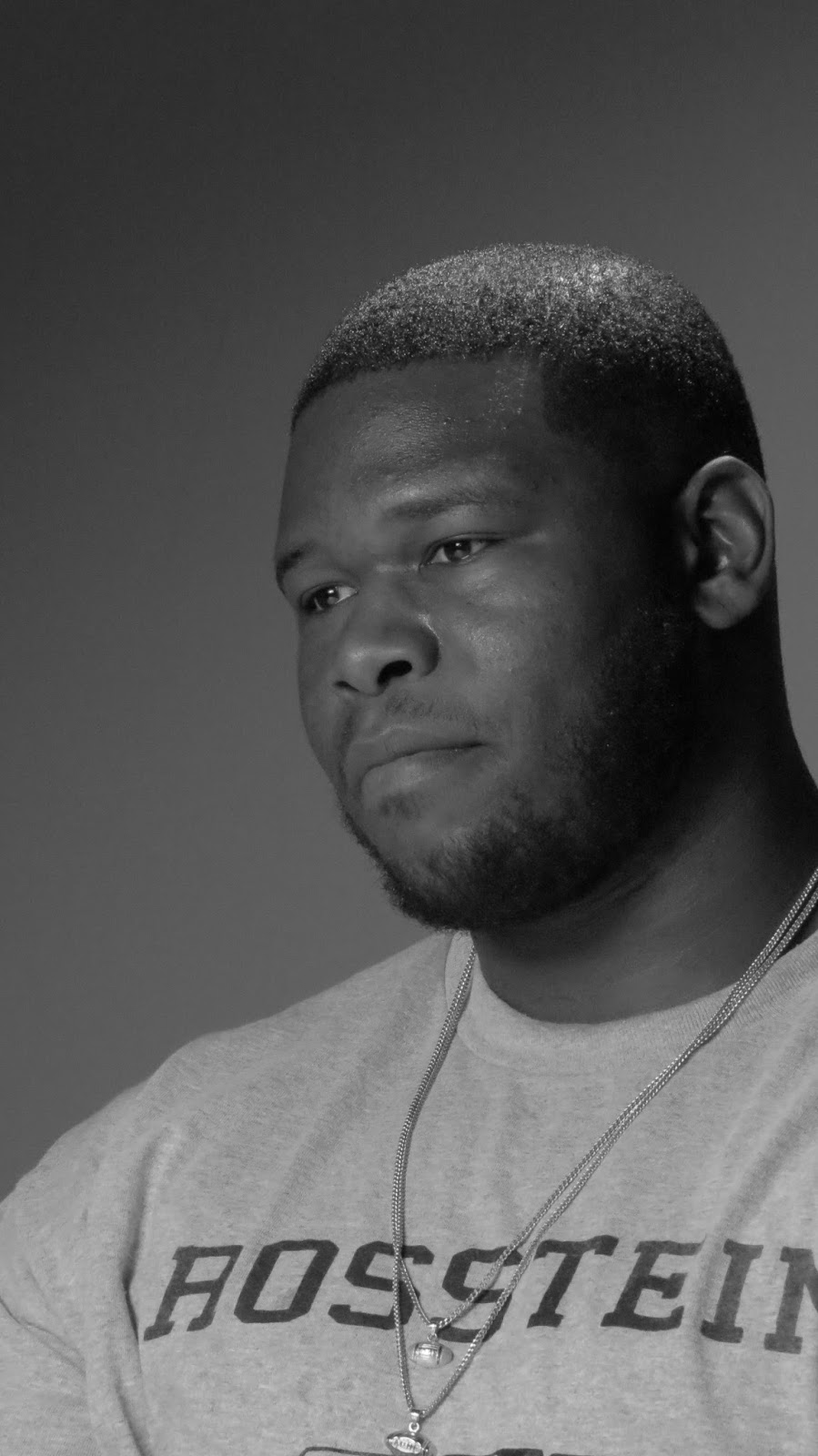
It was a treat and a learning experience to take pictures in a professional studio setting; I had never had that opportunity before and I learned a lot about how to take professional looking pictures. The Rembrandt lighting was more difficult than I thought it would be, but it was so exciting to capture images that were just so spot-on when I did get a better feel for it. I think the Rembrandt style of lighting is very dramatic and mysterious, sometimes you don't see the entire face because some parts are more shadowed than others, which then forces your eye and attention elsewhere on a particular part of the face.

f/5.6 1/125 ISO1600

f/5.6 1/125 ISO1600

f/5.6 1/125 ISO1600

f/5.6 1/125 ISO1600

f/5.6 1/125 ISO1600

f/5.6 1/125 ISO1600
Glamor Shots
With these pictures I chose to shoot in black and white. I love the depth and simplicity and classic characteristics of black and white photography and I think it is especially flattering when taking pictures of faces; it accentuates aspects of a person's facial structure, and it enhances a person's personality, and allows the beautiful and stunning aspects of their expressions and emotions to be brought to the forefront.
With these pictures I chose to shoot in black and white. I love the depth and simplicity and classic characteristics of black and white photography and I think it is especially flattering when taking pictures of faces; it accentuates aspects of a person's facial structure, and it enhances a person's personality, and allows the beautiful and stunning aspects of their expressions and emotions to be brought to the forefront.

f/5.6 1/125 ISO1600

f/5.6 1/200 ISO1600

f/5.6 1/200 ISO1600
f/5.6 1/250 ISO1600

f/5.6 1/250 ISO1600

f/5.6 1/250 ISO1600
Outdoor Shots
These were difficult due to the numerous light sources and trying to find a balance between everything. It was challenging but I love outdoor pictures and incorporating nature into the shot. It was definitely hard to have pictures taken of me as well, it's hard to keep your eyes open and smiling when it's so bright outside but the end results are definitely worth it.
These were difficult due to the numerous light sources and trying to find a balance between everything. It was challenging but I love outdoor pictures and incorporating nature into the shot. It was definitely hard to have pictures taken of me as well, it's hard to keep your eyes open and smiling when it's so bright outside but the end results are definitely worth it.

f/5.6 1/1250 ISO800

f/5.6 1/1250 ISO640

f/5.6 1/1250 ISO800
High Key vs Low Key
This was interesting; the dark background is very striking and dramatic and kind of isolates the individual with the high key, making them stand out but lacks context. The low key is a little more natural looking, and compliments the person rather than giving stark contrast between them and their surroundings. I like the low key look a little better.
This was interesting; the dark background is very striking and dramatic and kind of isolates the individual with the high key, making them stand out but lacks context. The low key is a little more natural looking, and compliments the person rather than giving stark contrast between them and their surroundings. I like the low key look a little better.

f/5.6 1/320 ISO1600

f/5.6 1/320 ISO1600

f/5.6 1/250 ISO1600

f/5.6 1/250 ISO1600


Editing Other Students' Photos
All I really did with these pictures was crop them a little bit and sharpen the detail. I darkened the exposure slightly just to give them a more natural look as well as increasing the contrast and playing with the color saturation to give the photos a richer look. Thanks for the pictures Kellie, great shots!
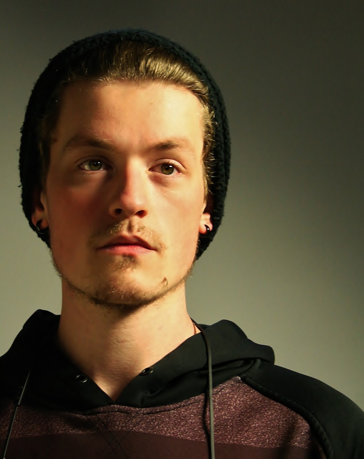
Photo by Kellie Busse

Photo by Kellie Busse
No comments:
Post a Comment